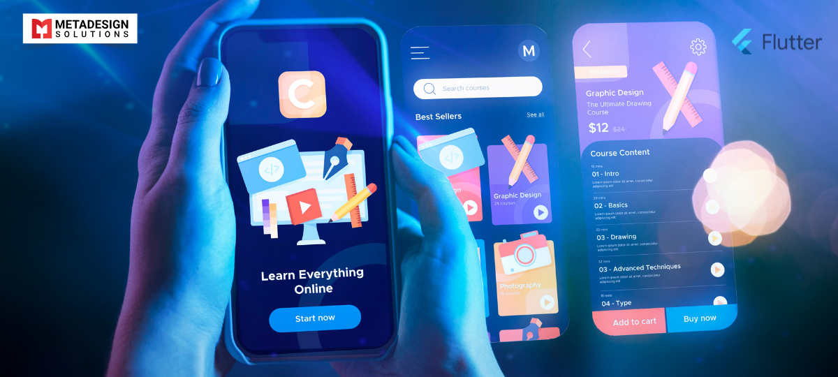
In today’s multi-device world, creating applications that provide a seamless experience across different screen sizes and orientations is essential. Flutter’s flexible UI toolkit makes it possible to build responsive and adaptive user interfaces with ease.
As someone deeply involved in Flutter app development services at MetaDesign Solutions, I’d like to share insights and practical tips on how to make your Flutter apps look and feel great on any device.
Understanding Responsive vs. Adaptive Design
- Responsive Design: Adjusts the layout dynamically based on screen size and orientation.
- Adaptive Design: Provides different layouts and functionality tailored to specific devices or screen sizes.
Key Takeaway: Combining both approaches ensures your app delivers the best possible user experience across all devices.
Techniques for Building Responsive UIs in Flutter
1. Use MediaQuery
MediaQuery provides information about the size and orientation of the device.
Example:
dart code
					Widget build(BuildContext context) {
  var screenWidth = MediaQuery.of(context).size.width;

  if (screenWidth < 600) {
    return MobileLayout();
  } else {
    return TabletLayout();
  }
}
Tip: Use MediaQuery to adjust font sizes, paddings, and other UI elements based on screen dimensions.
2. Leverage LayoutBuilder
LayoutBuilder allows you to determine the size of the parent widget and adjust the child widgets accordingly.
Example:
dart code
					LayoutBuilder(
  builder: (context, constraints) {
    if (constraints.maxWidth < 600) {
      return SingleColumnLayout();
    } else {
      return DualColumnLayout();
    }
  },
);
Build Seamless UIs with Flutter
Looking to improve your app’s performance across all screen sizes? Schedule a call now to discuss how we can implement responsive and adaptive designs using Flutter.
When to Use: Ideal for building widgets that need to adapt to their parent’s size.
3. Utilize Flexible and Expanded Widgets
These widgets help distribute space in Row and Column layouts.
Example:
dart code
					Row(
  children: [
    Expanded(
      flex: 2,
      child: LeftPanel(),
    ),
    Expanded(
      flex: 1,
      child: RightPanel(),
    ),
  ],
);
Benefit: Ensures your layout scales proportionally across different screen sizes.
4. Implement AspectRatio
Maintains a widget’s aspect ratio regardless of the screen size.
Example:
dart code
					AspectRatio(
  aspectRatio: 16 / 9,
  child: VideoPlayer(),
);
Use Case: Useful for media content where preserving the aspect ratio is important.
Creating Adaptive Layouts
1. Platform-Specific Widgets
Flutter provides widgets tailored to the look and feel of different platforms.
- Material Design: For Android.
- Cupertino: For iOS.
Example:
dart code
					Widget build(BuildContext context) {
  if (Platform.isIOS) {
    return CupertinoButton(
      child: Text('Press Me'),
      onPressed: () {},
    );
  } else {
    return ElevatedButton(
      child: Text('Press Me'),
      onPressed: () {},
    );
  }
}
2. OrientationBuilder
Adjust layouts based on the device’s orientation.
Example:
dart code
					OrientationBuilder(
  builder: (context, orientation) {
    if (orientation == Orientation.portrait) {
      return PortraitLayout();
    } else {
      return LandscapeLayout();
    }
  },
);
Advantage: Enhances user experience by optimizing the layout for the current orientation.
Practical Implementation: A Responsive Dashboard
Scenario: We developed a dashboard app that needed to function seamlessly on both mobile and tablet devices.
Approach:
Used GridView: Adjusted the number of columns based on screen width.
dart code:
					GridView.count(
  crossAxisCount: screenWidth < 600 ? 2 : 4,
  children: [...],
);
- Dynamic Content Loading: Loaded different amounts of data based on available space.
Result: The app provided an optimal experience on all devices, leading to increased user engagement.
Tools and Packages to Assist
- flutter_screenutil: For adapting UI elements to different screen sizes.
- responsive_builder: Simplifies building responsive layouts.
- Sizer: Helps with responsive sizing of widgets and fonts.
Recommendation: Evaluate these tools to see which best fits your project’s needs.
Challenges and Solutions
- Complex Layouts: Designing for multiple screen sizes can be challenging.
Solution: Start with a mobile-first approach and progressively enhance for larger screens. - Performance: Responsive calculations can impact performance.
Solution: Optimize by minimizing the use of heavy computations in build methods.
How MetaDesign Solutions Can Help
At MetaDesign Solutions, we have extensive experience in building responsive Flutter apps.
Our Expertise:
- Custom UI/UX Design: Crafting intuitive and engaging interfaces.
- Cross-Platform Development: Ensuring consistent performance across devices.
- Performance Optimization: Delivering smooth and efficient applications.
Why Work With Us:
- Experienced Team: Skilled Flutter developers and designers.
- Client-Centric Approach: Tailored solutions to meet your specific needs.
- Proven Success: A track record of delivering high-quality apps.
Get in Touch
Ready to build a responsive Flutter app that delights your users?
Contact us at sales@metadesignsolutions.com to discuss your project.
Related Keyphrase:
#Flutter #FlutterDev #MobileAppDevelopment #FlutterUI #ResponsiveDesign #AdaptiveUI #FlutterApps #AppDevelopment #CrossPlatformDevelopment #UIUXDesign #MobileAppSolutions #FlutterDevelopment #FlutterUIComponents #FlutterDesign #AppDesign #TechSolutions #FlutterCommunity #FlutterAppDevelopmentCompany #FlutterAppDevelopmentServices #HireFlutterDevelopers #AppDevelopmentServices #FlutterExperts #AppUI #FlutterResponsiveDesign #MobileUX #UIComponents #HireUIUXDevelopers #UIUXDevelopmentCompany #UIUXDevelopmentServices


